Well, if you look around yourself then you will find a lot of logos. We all are always impressed with the designs. This factor is observed by the companies and now using the logo as the brand identity by creating it very nicely.
Brands are investing a lot of money in making impressive and creative logos for them. As visual identity is always crucial to make a great first impression, in that case, a well-designed logo is key. Users can easily remember the visuals that are the reason the designer tries to make professional logo design impactful and memorable.
However, logos are not just a combination of color, font, icons, and some more design elements. Many companies have taken the best use of logo design to make it meaningful by adding some stories to it. For that, designers need to take the best and creative use of elements. At the same time, the personality of the brand is also not compromised. So, let’s discuss how designers can add stories to the logo.
#1. Amazon

When it comes to the story behind the logo design then nothing can match the level of Amazon. They have nicely implemented that thing in their logo.
If you observe the design carefully then the yellow arrow goes from letter A to Z. That shows they have a wide range of products, from A to Z, they have every variety to serve. Moreover, that arrow makes the smile which they believe people would surely experience after purchasing the product from their store. So, this is how designers have used their creativity to make the logo appealing and meaningful.
#2. Mercedes-Benz
If we look at the automobile sector, there are a lot of companies who have portrayed the story in the custom logo design. Among them, one of the most popular ones is Mercedes-Benz.
This is the merger of two different companies one is Mercedes and the other is Benz. Firstly, the Mercedes company has a logo as just the three point star which represents land, water, air, and the circle comes from the Benz. Therefore, the combination of that point star and circle together represent the Mercedes-Benz logo.
#3. Toyota
Toyota is a popular car manufacturing company. The logo design of it has been around since the 1990s.
The designer has nicely managed the full name in their professional logo design. Separate the rings in the design one by one, then makes the whole brand name. At first attempt, you may never observe it, but careful observation will surprise you with it. Furthermore, you look at the logo then there are two perpendiculars, inside the bigger oval. That represents the heart of the customer and the company. Thus, this is how it is designed with some story in it.
#4. FedEx
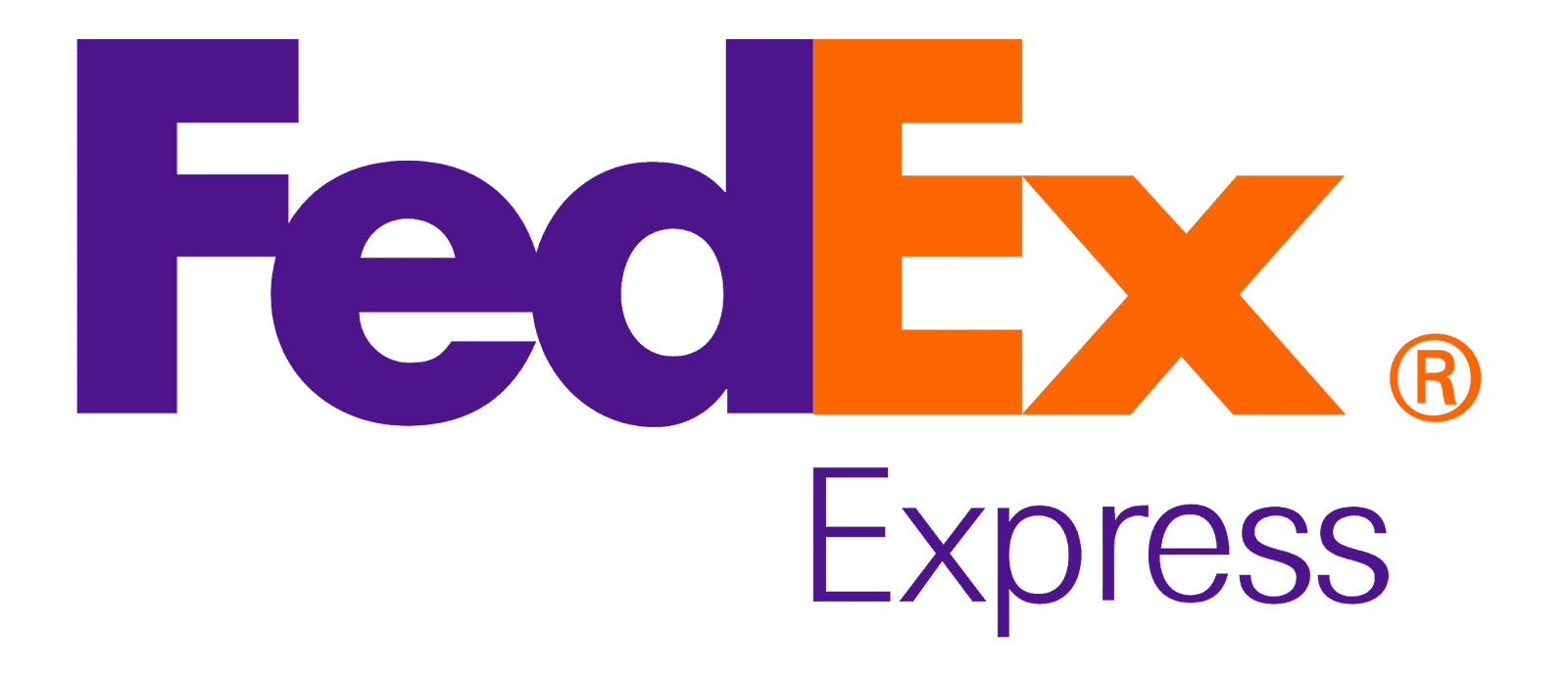
FedEx is a multinational shipping company. It’s one of the most popular delivery service companies. You may observe it in trucks and planes all over the world.
If you observe the logo design then it just looks like the name written on it but in between the letter E and X. You can find the hidden straightforward arrow in it which shows the speed, accuracy of delivery they assure to their customers. So, this is how in simple design but they have nicely depicted the story in it.
#5. Vaio
Sony Vaio is one of the most popular visual audio intelligent organizers. By looking at the professional logo design, it looks confusing for the first time but it has some quality meaning in it.
It’s a brand that integrates analog and digital technology in its product and the same is illustrated in logo design. The first two letters represent analog signals and the other two letters show the digital signal in the form of 0 and 1 as binary code. Therefore, they have cleverly shown the product of the brand in the design.
#6. Cisco

Cisco is one of the biggest networking companies in the world. The headquarters is located in San Francisco. Due to that, they have nicely added the famous Golden bridge of the city in logo design. The blue strip shows that bridge and along with that it also represents electromagnetic.
#7. Baskin Robbins
Popular chain of ice cream and cake specialty restaurants. The logo includes the full brand name along with its initials. However, if you look at the initials then the pink design makes the 31. It shows a limitless flavor of ice cream that you can experience differently for every day of the month. Even the color of the logo design evokes the feeling of fun and energy which users might experience after eating ice cream.
#8. NBC
Another very good example of how any company can include some hidden meaning in it. NBC is popular for that reason. It’s obvious that it includes peacock in the design but there is a reason behind it. At the time the logo was designed, the color television was just introduced in the market. And NBC wants to spread that news all over the world and make it popular. The six different colors in the professional logo design denote six divisions of NBC.
#9. Hyundai
It’s clear that the letter ‘H’ denotes the initial brand name. However, this South Korean company is presenting something more than the letter in the logo. It’s two people shaking hands with each other. Those are a customer and company representatives. So, this is how they have cleverly displayed a great message which connects people with the company.
#10. Adidas
One of the most favorite brands among sportspeople. They have set a standard in products like clothes and shoes related to any sport and become internationally popular.
From the first design of the logo till the last, one thing common is you will always observe the strip in it. It is representing the mountains and shoes the challenges and difficulties any athletes need to face in their career.
Wrapping up
Undeniably, the logo is not just the color, font, icon, and shapes. It’s beyond that. It must include some hidden meaning behind that, so it becomes much more memorable. The above-mentioned are some of the most popular logos which set an example of how you can make it with some story in it.